In this medical office consultation room makeover, the owner wanted a more upscale, yet comfortable and inviting feel for the room. They had a nice desk and console they had already purchased. The space just needed a little softening up. And that’s exactly what we did! First up, as always, is paint color. We suggested a subtle, soft gray – SW Comet Dust.It’s my favorite neutral gray tone. I love it so much I painted my walls with it!
The work area
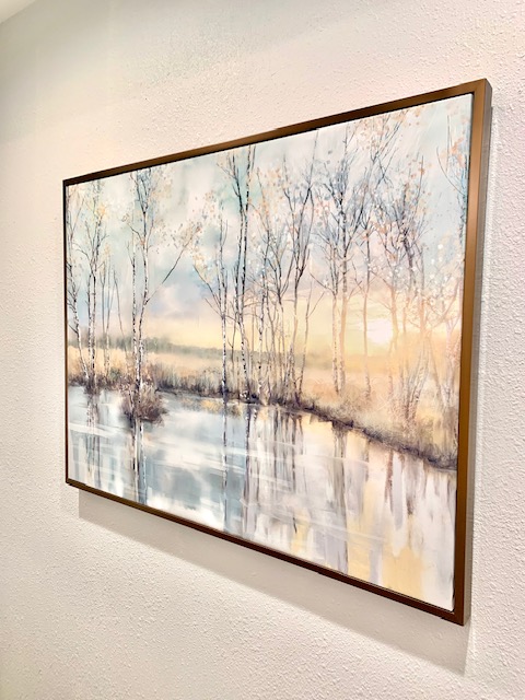
We started by relocating the console from behind the desk to the opposite wall to create a more balance floor plan and a more roomy working area. The dark art was replaced with a light and airy trimmed canvas. This working area was topped off with a beautiful cream, leather rolling chair.
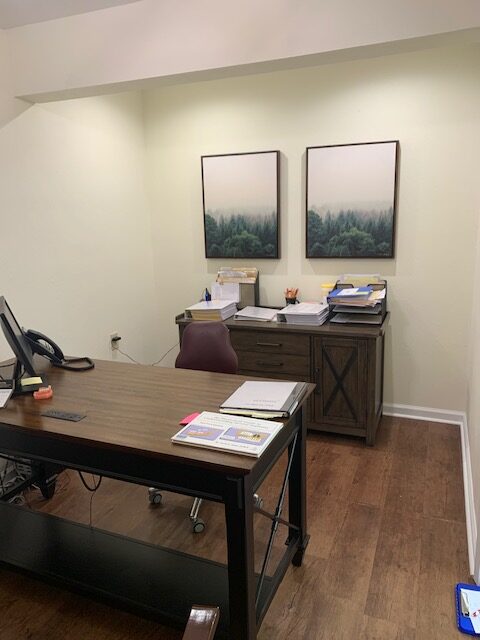
BEFORE 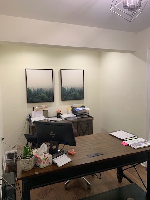
BEFORE
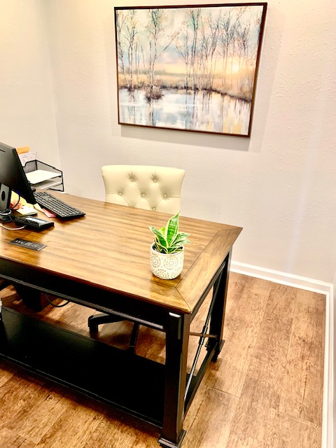
AFTER 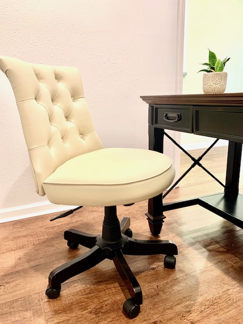
AFTER
the client area
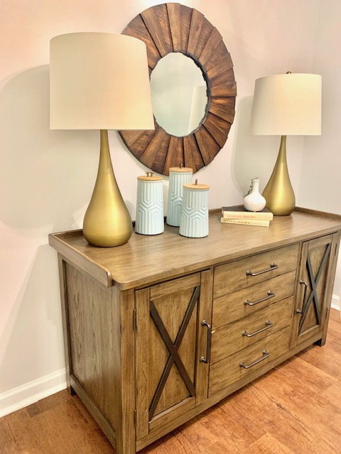
You’ll noticed the brightness of the room has significantly changed. This stylish drum-style chandelier added a boost of brightness and complimented the modern, rustic design of the space. And because we always use what our clients have first, we snagged this lovely round, wooden mirror from the nearby bathroom. It is perfect!
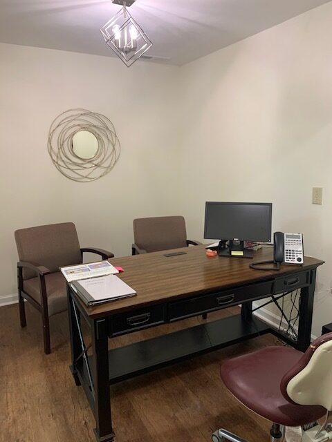
BEFORE 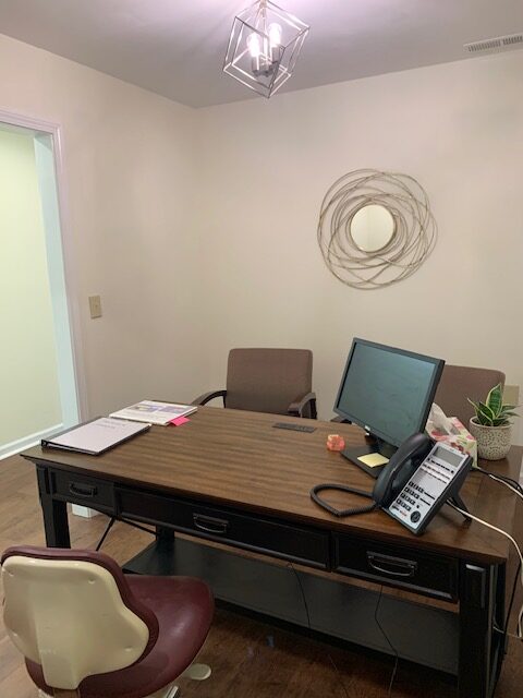
BEFORE
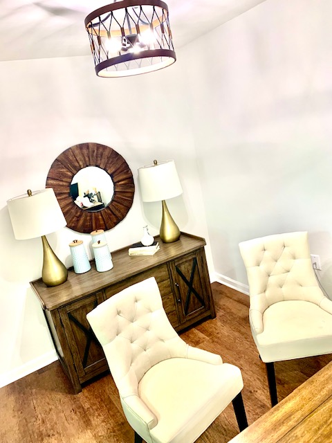
AFTER 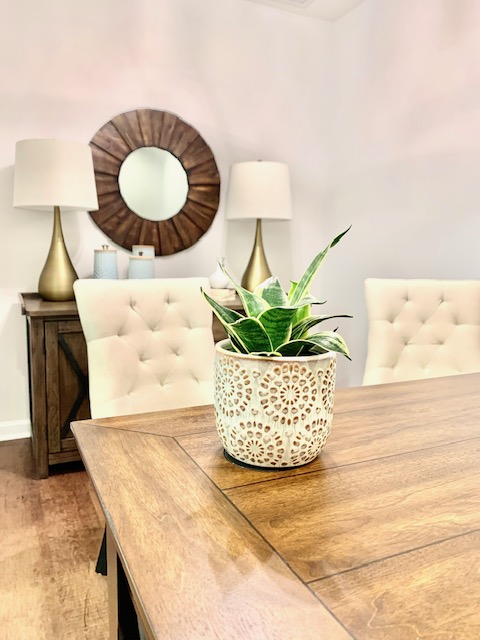
AFTER
Be creative with accessories
It may not be obvious but the soft blue accessories are canisters. Don’t be afraid to be unconventional with your styling. The color, texture and size was right these unique kitchen cannisters made the cut! Also, use a varying shapes throughout your design to achieve a balanced look.
AFTER 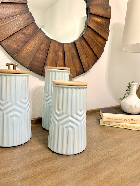
AFTER
AFTER 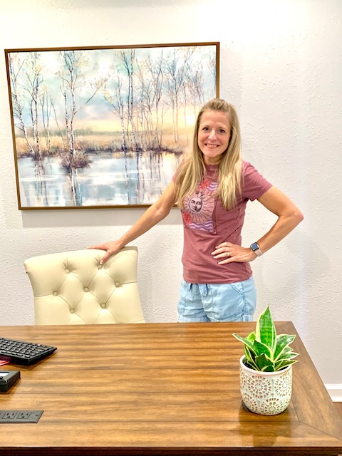
AFTER
the result
The client was pleased with this consultation room makeover and their client’s experience will be more pleasant because of the welcoming feel of this space.
Need to get a jump start on your project? Book a Design Advice on the Fly call with Christy.
Leave a Reply