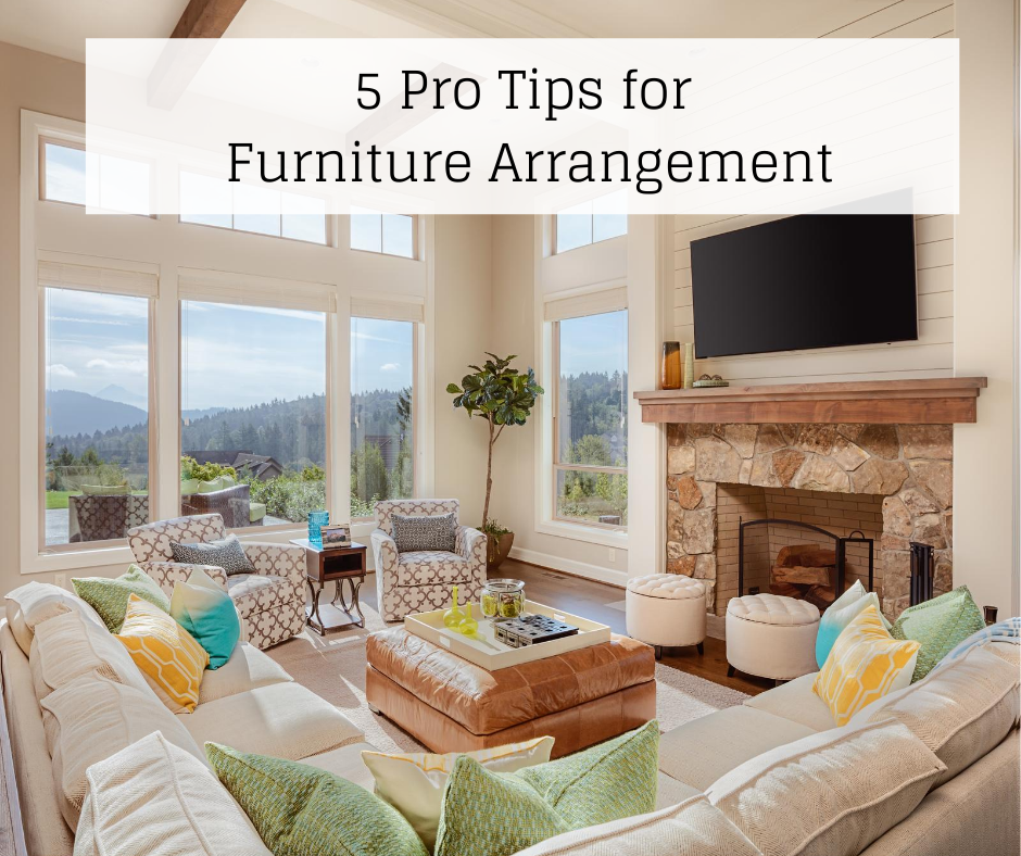
Living rooms come in all shapes and sizes. Often, it can be tricky to determine the best arrangement in order to experience the best flow and function. If your living room layout is a drag, it’s likely going to affect the way your home functions for the entire family.
The Example
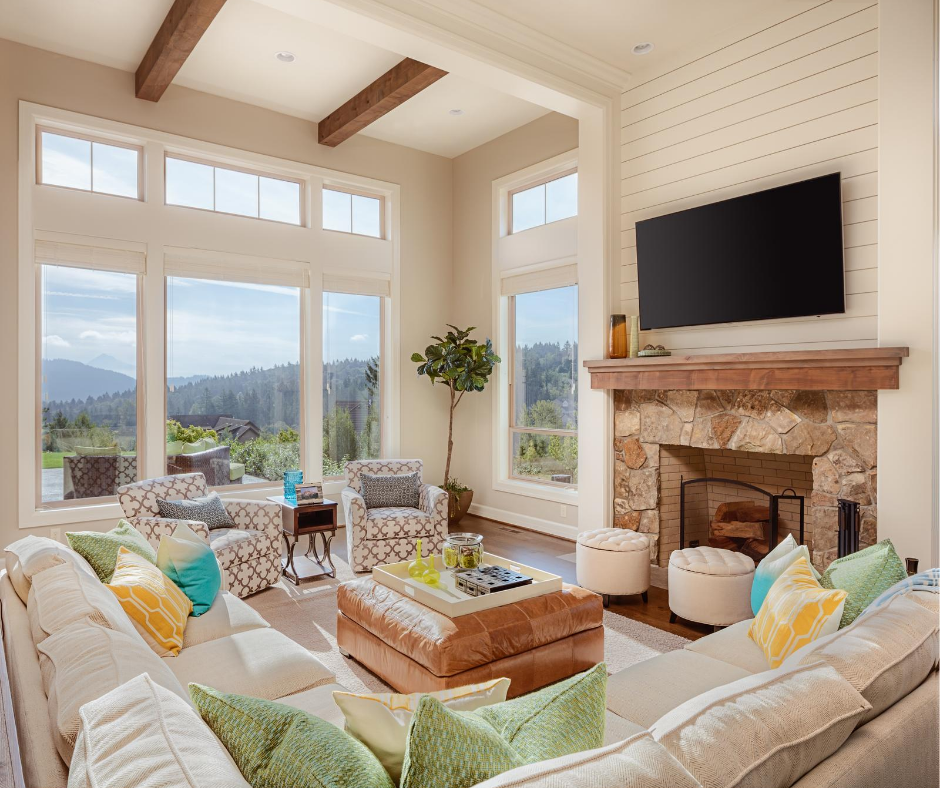
Take a look at this fabulous arrangement pictured above where flow and function are clearly maximized. Now, let’s talk about what makes this arrangement so fabulous.
5 Pro tips
Apply these 5 simple Pro Tips to your room arrangement and enjoy the result!
1. choose a focal point
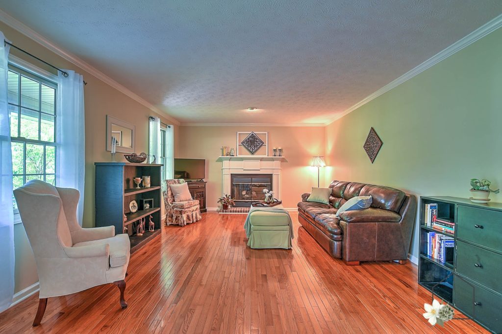
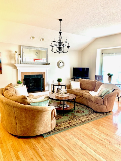
Choose a focal point. I often see arrangements that have either multiple, competing focal points or no focal point at all. You may have a fireplace in your room, but you also need a TV. A common option is to hang the TV above the fireplace. However, that is not an option in all cases. This can create a focal point issue. Take a look at these 2 examples of how I arranged around the fireplace focal point while also adding a TV to the room without creating a competing arrangement. TV watching was not the primary purpose of either of these rooms so this arrangement worked well.
.
2. consider traffic flow
If your flow of traffic runs straight through the middle of your living room, rethink your arrangement. This is not ideal. One way to route traffic flow around the parameters of your seating area is to pull furniture away from the walls. Many people think they must place all furniture on the wall. That is just not the case. You create a much cozier, intimate feel when you pull your seating towards the center of the room. If you have a super tiny living room, this may present a challenge. However, your solution may be smaller furniture pieces.
3. Create conversation area
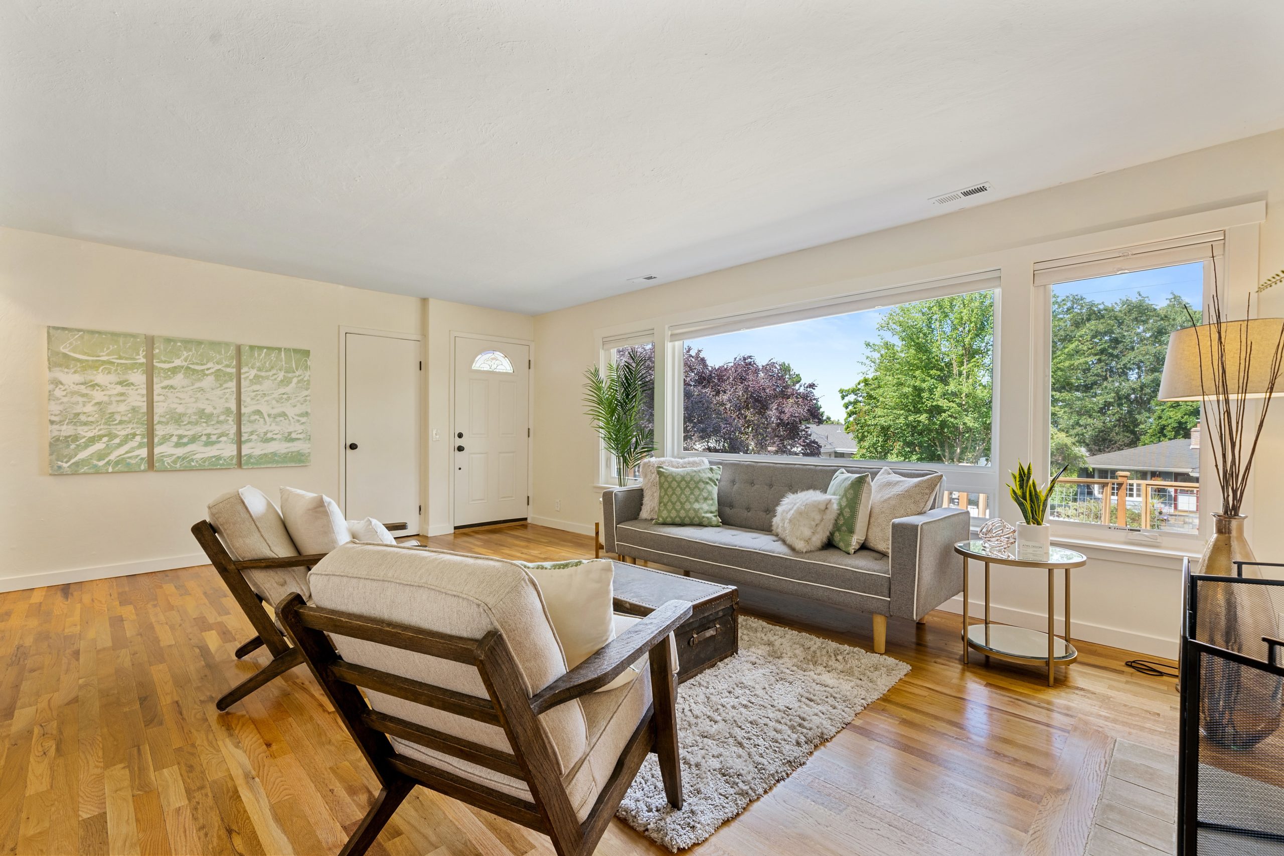
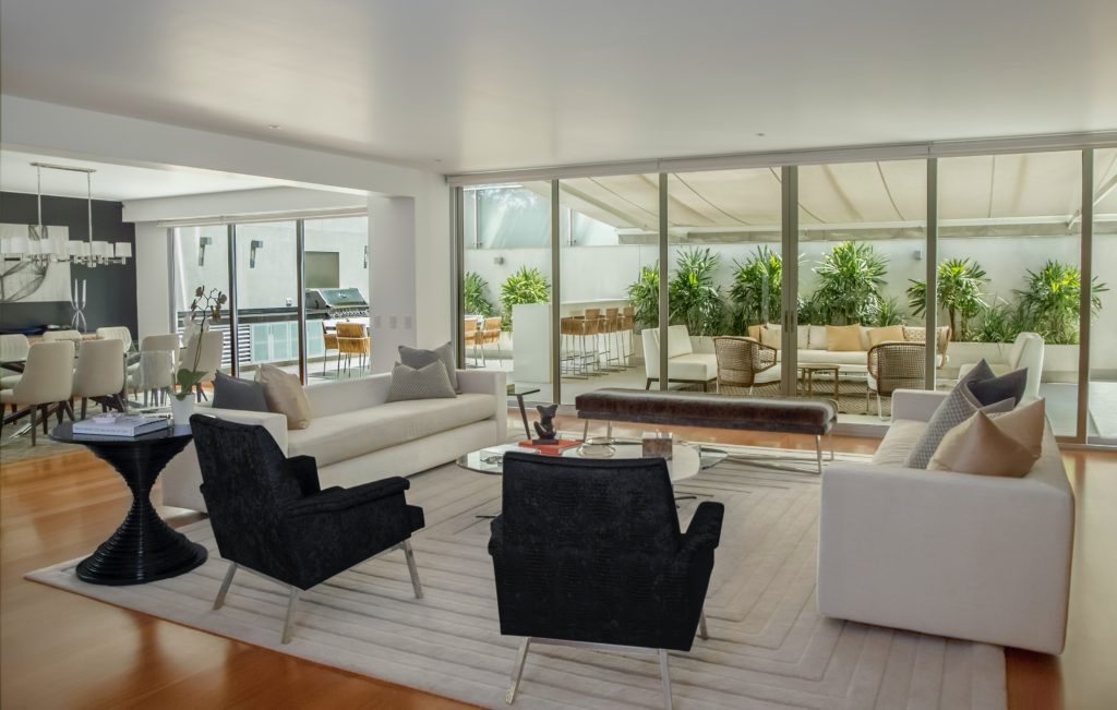
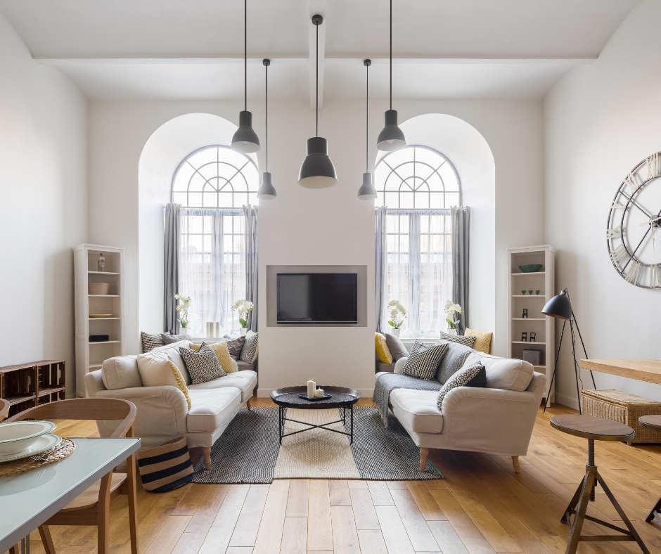
A common function of the living room is for TV watching. However, if you want to encourage family conversation, arrange your furniture with this goal in mind. It’s like the saying goes, “dress for the job you want, not the job you have”. Likewise, arrange for the function you want, not the function you currently have. Even if your most common use of the room is TV watching, arrange the seating for conversational opportunities. Chances are, if all the seating is facing the TV only, no one is going to be inclined to interact with one another. The below is an exceptional example of a great conversational seating arrangement. Try it and see what happens!
4. Use right-sized rug
Nothing hurts my eyes more than a large, floating run in the middle of the living room. OK, so that might be an over-statement. There are worse design flaws, but this is definitely in the top 10. Make sure the front legs of every seat is sitting on the rug. If that isn’t currently the case, pull your seating in or buy a bigger rug. Rugs are meant to add texture and softness to a room, but to also set the parameters of the seating area.
5. Put tables within reach
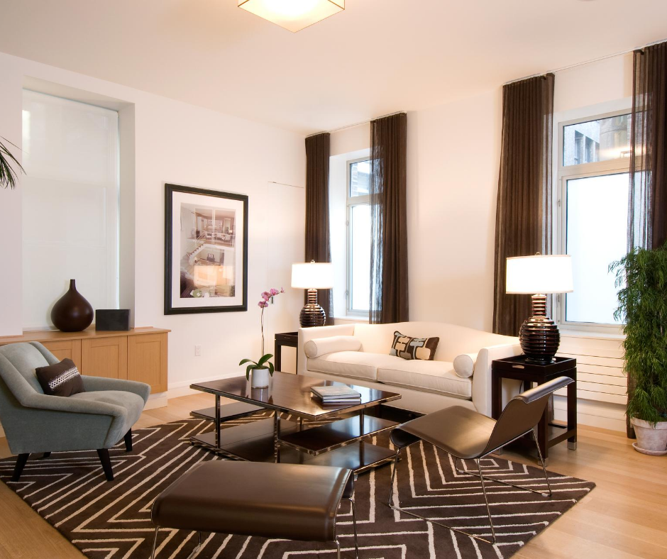
What’s the point of a coffee table and end table if you can’t reach them comfortably? If you have to stretch or get out of your chair to reach your beverage, you have two choices. You can either move the table closer to the chair or get a bigger table. Seating areas are supposed to be comfortable and effortless. If your lounging experience is creating work for you, it’s not working. It’s ideal for each seat to have easy access to a flat surface. That flat surface could be a pouf or ottoman with a small tray.
Give these 5 Pro Tips a try and let me know how it goes. Email me at christy@homestylingstudio.com. I love sharing DIY before and after pics! Need a little more help, book your complimentary Design Chat HERE. What is a Design Chat? Learn about it.